Kambric Goods

Services

Branding, Packaging, Typography

Client

Kambric Goods

Year

2018

A refreshed identity and packaging system for a clothing designer carrying forward her grand-mother's legacy of 1960's hand-painted patterns. 
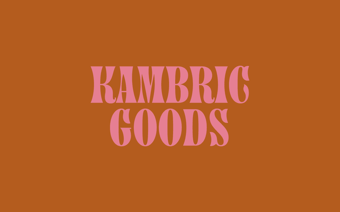
Wordmark

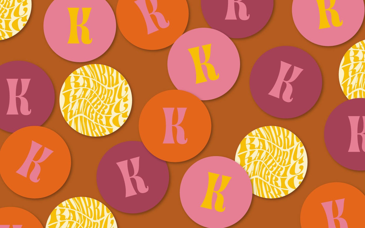
A visual identity merging authentic western type and psychedelic graphics. Taking inspiration from 60's psychedelic ephemera, we also created typographic patterns to work across the system.

A visual identity merging authentic western type and psychedelic graphics. Taking inspiration from 60's psychedelic ephemera, we also created typographic patterns to work across the system.

Typography and Color

The typography and colors for the brand were inspired by the 1960’s vibe of the retro prints created by the owner's grandmother. To honor her legacy we were looking to modernize the identity while still evoking a strong sense of history.

Typography and Color

The typography and colors for the brand were inspired by the 1960’s vibe of the retro prints created by the owner's grandmother. To honor her legacy we were looking to modernize the identity while still evoking a strong sense of history.

We went to Type Directors Club in New York City and pulled specimens to arrive on Painters Roman, a slightly western serif with hippie-esque curves. Type Designer Matthew Smith worked with us to create an owneable mark with accentuated details.

We went to Type Directors Club in New York City and pulled specimens to arrive on Painters Roman, a slightly western serif with hippie-esque curves. Type Designer Matthew Smith worked with us to create an owneable mark with accentuated details.

The Team

Creative Director: Meryl Vedros
Designers: Vicky Chau and Meryl Vedros
Type Designer: Matthew Smith
Special Thanks: Type Directors Club