Deep Roots

Services

Branding, Illustration, Packaging, Copywriting, Web Design

Client

Deep Roots Botanical Goods

Year

2020

A southwestern journey to inspire a brand that celebrates organic form and wellness through artful expressions.

Deep Roots is a female-owned skincare and wellness brand born out of deep respect for nature and plant wisdom.

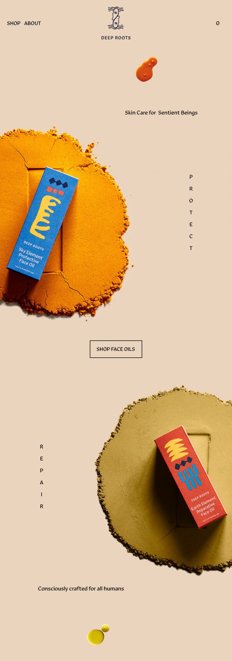
With the mission to elevate ordinary routines into rituals of sensory engagement, we crafted an identity and packaging system that celebrates organic form and artful expression.

When Margeaux shared her inspiration for the brand with us, we knew our drawing boards were better situated out of office, in the desert.

When Margeaux shared her inspiration for the brand with us, we knew our drawing boards were better situated out of office, in the desert.

Big Bend

New Mexico

Big Bend

New Mexico

We spent 3 weeks getting inspired in Marfa, Big Bend, and Santa Fe while designing, painting, and developing organic shapes and forms which reflected the brand's southwestern spirit.

We spent 3 weeks getting inspired in Marfa, Big Bend, and Santa Fe while designing, painting, and developing organic shapes and forms which reflected the brand's southwestern spirit.

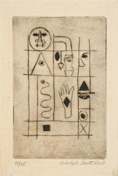
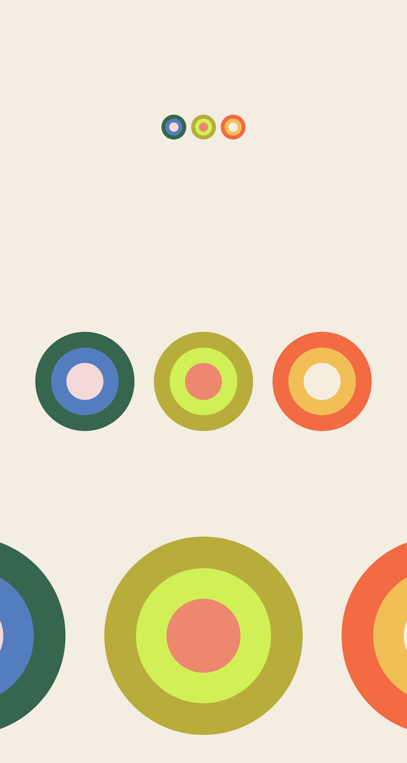
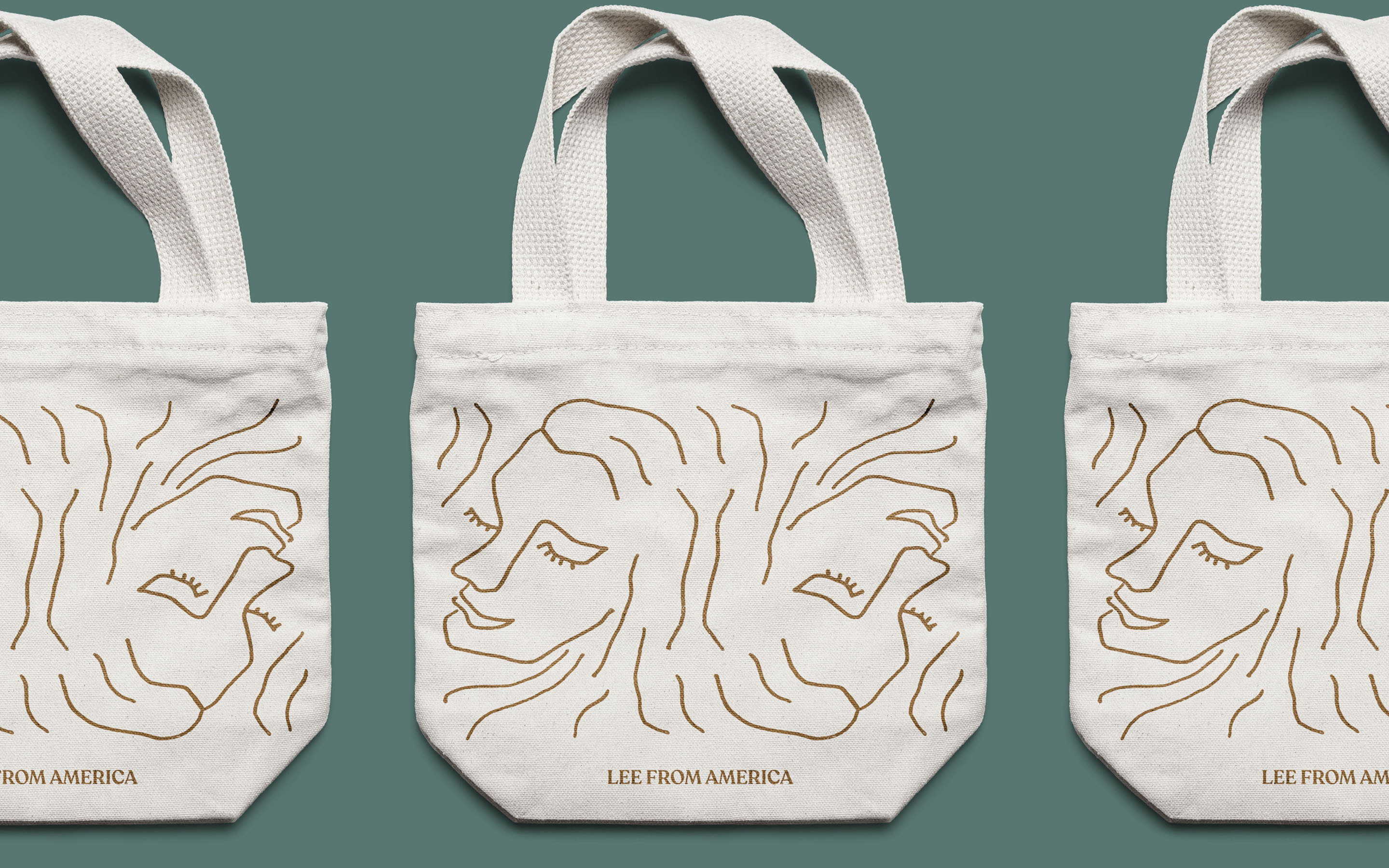
Keeping Deep Roots at the center, we explored abstract forms, organic shapes, symmetry and structure. The faces, also inspired by the high desert, merge at times as a nod to the female community. It also expresses the duality of the radical night and day shift. Product names are inspired by the elements, highlighting the unique functionality and impact of each formula as well as their intrinsic connection to the natural world. Understanding that the act of self-care itself can be transformative, we saw the writing as invitations to bask in these actions — like momentary inhalations and exhalations of intention and possibility.

Keeping Deep Roots at the center, we explored abstract forms, organic shapes, symmetry and structure. The faces, also inspired by the high desert, merge at times as a nod to the female community. It also expresses the duality of the radical night and day shift. Product names are inspired by the elements, highlighting the unique functionality and impact of each formula as well as their intrinsic connection to the natural world. Understanding that the act of self-care itself can be transformative, we saw the writing as invitations to bask in these actions — like momentary inhalations and exhalations of intention and possibility.

The Team

Creative Director: Meryl Vedros
Art Director and Strategist: Samihan Shani
Copywriter: Dana Covit
Lead Designer and Illustrator: Meryl Vedros
Web Design Team: Samihan Shani, Meryl Vedros