Shut The Kale Up

Services

Branding, Cultural Research, Web Design

Client

Jeannette Ogden

Year

2020

Jeannette Ogden, an LA based health enthusiast and influencer brought on our west coast team to break glass ceilings and rebrand herself as a latino in the wellness space.

With our mission to disrupt the industry, we went beyond the surface and took inspiration from her Mexican roots and found authentic ways to layer it with her LA home and the spirit of her personality.

Our Concept

During the development of the STKU rebrand, we held on to four words Jeannette said to us in our kick-off meeting, "Honesty is my brand." This became the foundation of the project and our intent to develop a brand identity that represented her authentic self.

Our Concept

During the development of the STKU rebrand, we held on to four words Jeannette said to us in our kick-off meeting, "Honesty is my brand." This became the foundation of the project and our intent to develop a brand identity that represented her authentic self.

"I just want a brand that says welcome to my home" Jeannette said in passing as we were diving into concept development. Studying the idea of home as a cultural layer to Mexico, we obsessed over tile motifs, subversive uses of pattern and color play.

"I just want a brand that says welcome to my home" Jeannette said in passing as we were diving into concept development. Studying the idea of home as a cultural layer to Mexico, we obsessed over tile motifs, subversive uses of pattern and color play.

Decorative tile from a home kitchen in Ocotlan Mexico

The Mark

A square symbolizes the Mexican tile as a symbol for home, individualism of self and the collective nature of community gathering.

The Mark

A square symbolizes the Mexican tile as a symbol for home, individualism of self and the collective nature of community gathering.

Color Palette

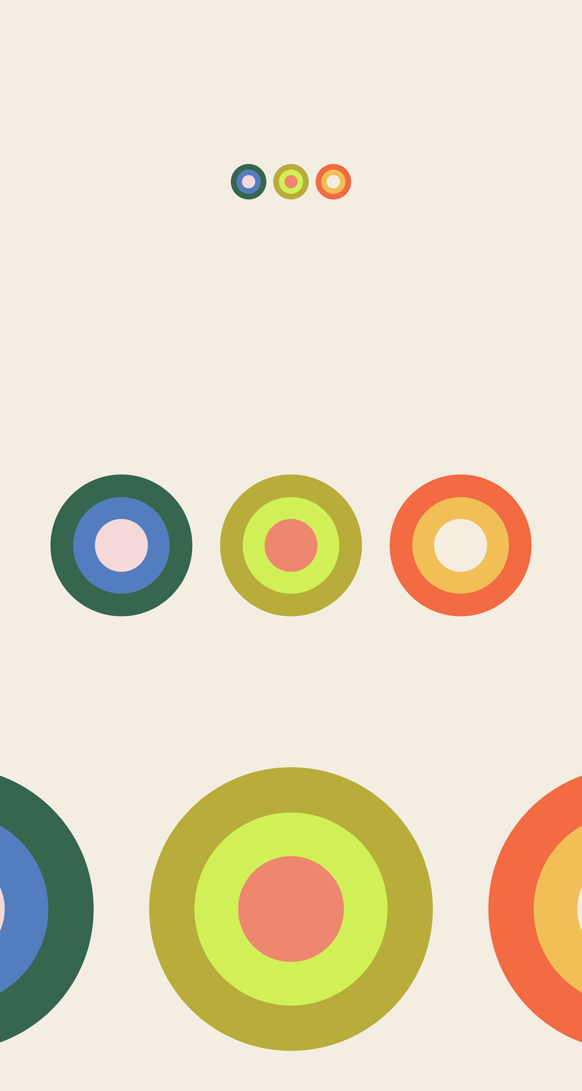
Our internal findings revealed that Jeannette's Instagram leans into two color palettes which to our surprise, merged seamlessly with our Mexico studies. We narrowed down to 7 colors for the STKU brand and divided them into two parts for her brand.

Color Palette

Our internal findings revealed that Jeannette's Instagram leans into two color palettes which to our surprise, merged seamlessly with our Mexico studies. We narrowed down to 7 colors for the STKU brand and divided them into two parts for her brand.

We discovered a contrasting palette to highlight nurturing moments of motherhood, postpartum positivity, and natural family-style living – aligning them with the craftwork of women artists in the history across Mexico.

We discovered a contrasting palette to highlight nurturing moments of motherhood, postpartum positivity, and natural family-style living – aligning them with the craftwork of women artists in the history across Mexico.

Typography

The use of two contemporary typefaces balanced the heritage focus of the brand by bringing in Jeannette's character though strength, sophistication, feminity within form.

Typography

The use of two contemporary typefaces balanced the heritage focus of the brand by bringing in Jeannette's character though strength, sophistication, feminity within form.

Glysa, an elegant serif, serves as a display font for bold yet humble expressions that are true to Jeannette's warm and approachable personality.

Glysa, an elegant serif, serves as a display font for bold yet humble expressions that are true to Jeannette's warm and approachable personality.

Supply, a modest monospace typeface, serves to evoke early typewriter styles and Jeannette's intelligent voice via her space as a blogger in the digital space.

Supply, a modest monospace typeface, serves to evoke early typewriter styles and Jeannette's intelligent voice via her space as a blogger in the digital space.

Graphic Expression

We layered moments of surprise across the system, leaving rules at the door. Instead, we developed an infinite tool kit for play where Jeannette's casual self and love for family roots could reflect in a brand that brought heritage home.

Graphic Expression

We layered moments of surprise across the system, leaving rules at the door. Instead, we developed an infinite tool kit for play where Jeannette's casual self and love for family roots could reflect in a brand that brought heritage home.

Coasters

Radiating sun varieties. An eloquent icon for STKU symbolizing life, strength, and influence while also honoring the brands origin in sunny Los Angeles.

Radiating sun varieties. An eloquent icon for STKU symbolizing life, strength, and influence while also honoring the brands origin in sunny Los Angeles.

The study of patterns and design systems found on tiles in Mexican kitchen and homes inspired a flexible system for the brand to live in a playful ecosystem.

The study of patterns and design systems found on tiles in Mexican kitchen and homes inspired a flexible system for the brand to live in a playful ecosystem.

Limited Edition Beach Towels

The Team

Creative Director: Meryl Vedros
Strategist: Samihan Shani
Designers: Vicky Chau, Meryl Vedros
Cultural Research: Samihan Shani, Meryl Vedros